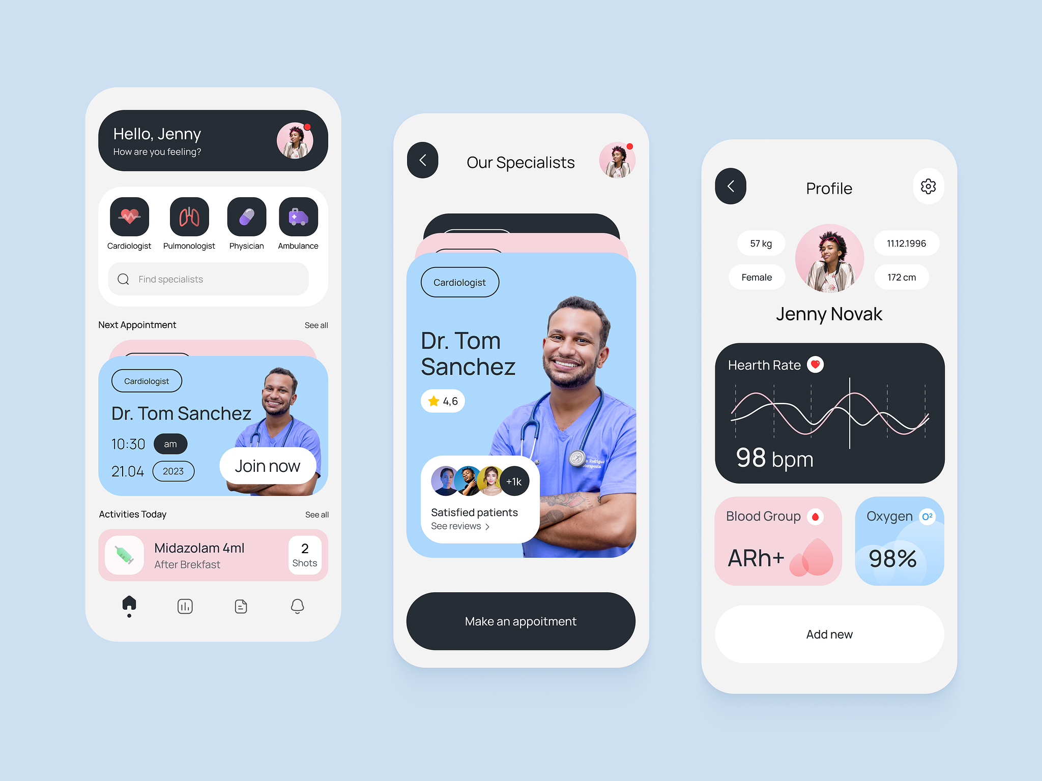
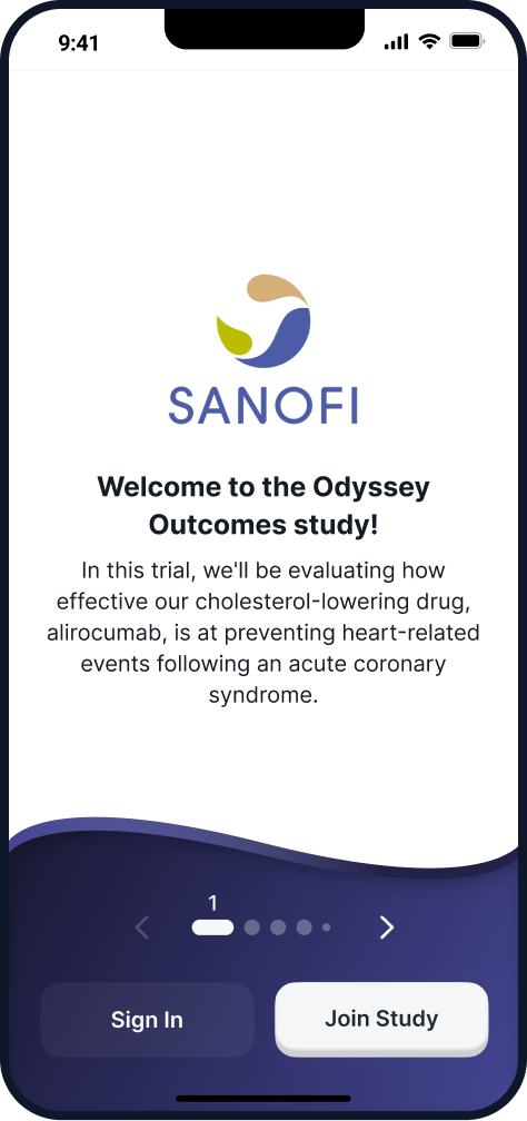
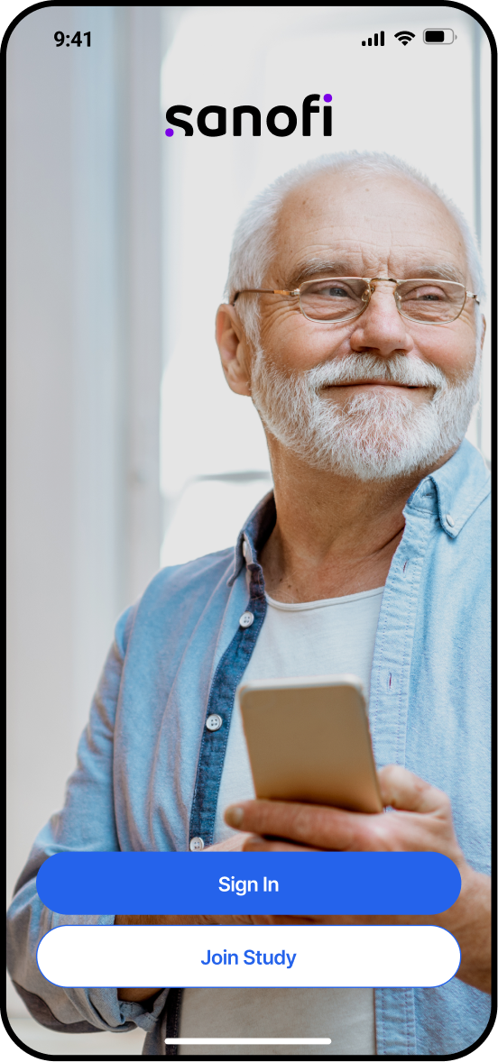
Enabling medical trials
Worldwide 🌎
problem statement
The company had an ongoing app but felt they needed to revisit the experience before scaling the features.

Visual redesign
for the base app

Map and Rethink all user flows

Scale with
design tokens
Mapping a white label application
The results
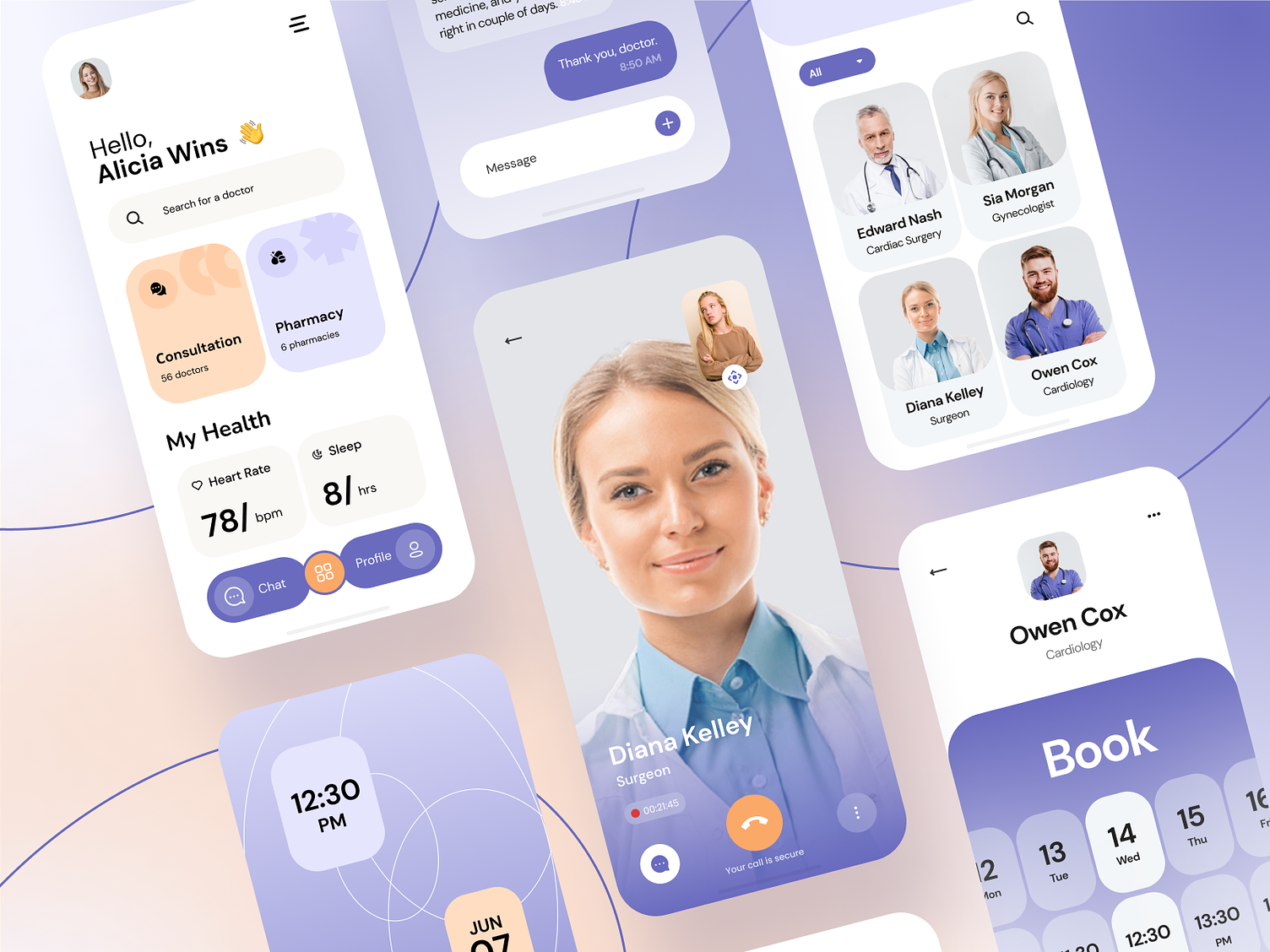
moodboard research
First, a glance into concepts for mobile health applications for visual inspiration.
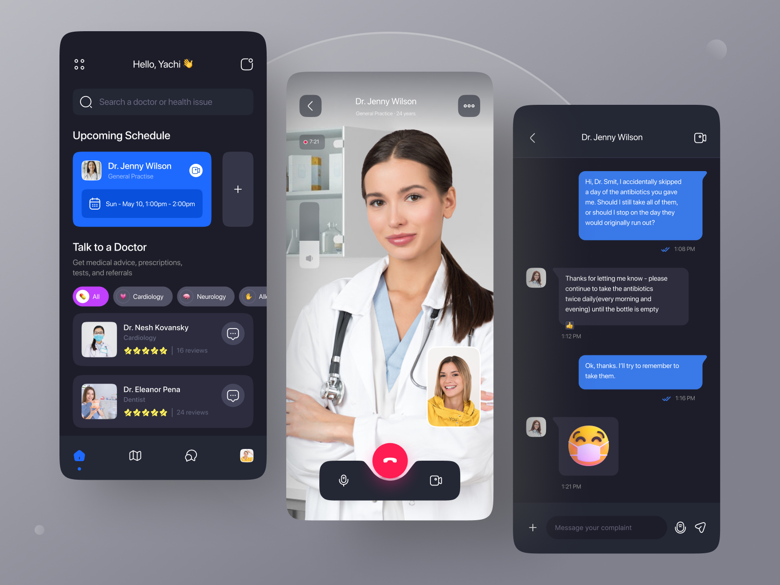
benchmark research
Then went after existing health applications and
how do they work.
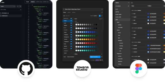
Creation of a
Design System
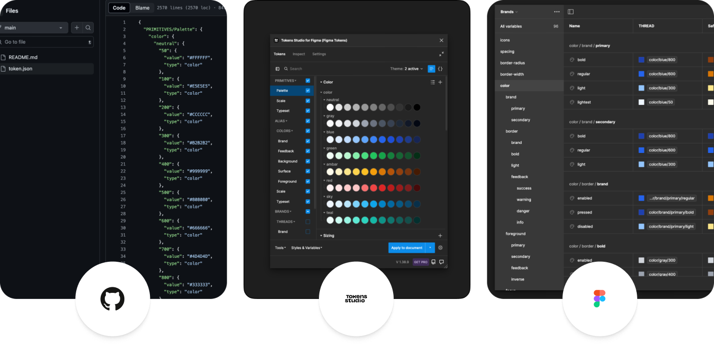
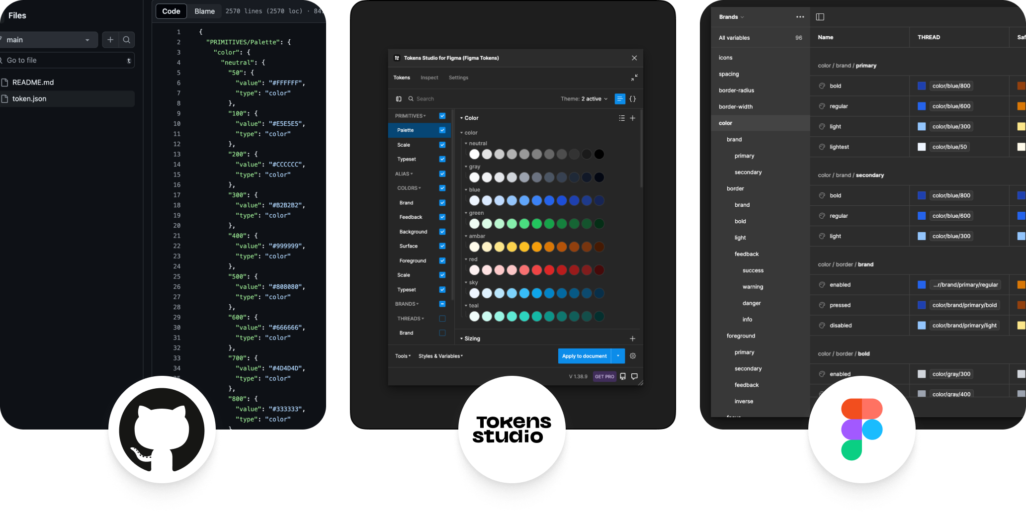
Using this process, it's possible to unlock the power of design tokens in Figma and keep code in sync with design decisions.
typography
Only few typefaces have the needed support for multi-languages. Testing the top #3 lead to Inter.
Inter
USAGE
4.68 billion
Number of times Google Fonts API served Inter over a week.
language support
Africa
457
Americas
127
Asia
104
Europe
161
Oceania
28
what's the color?
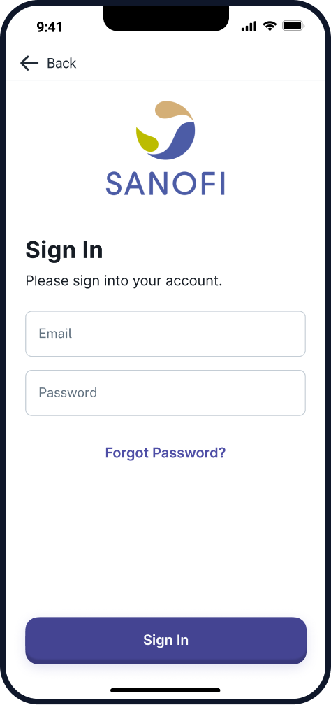
As the application was a white label, no specific color was chosen.
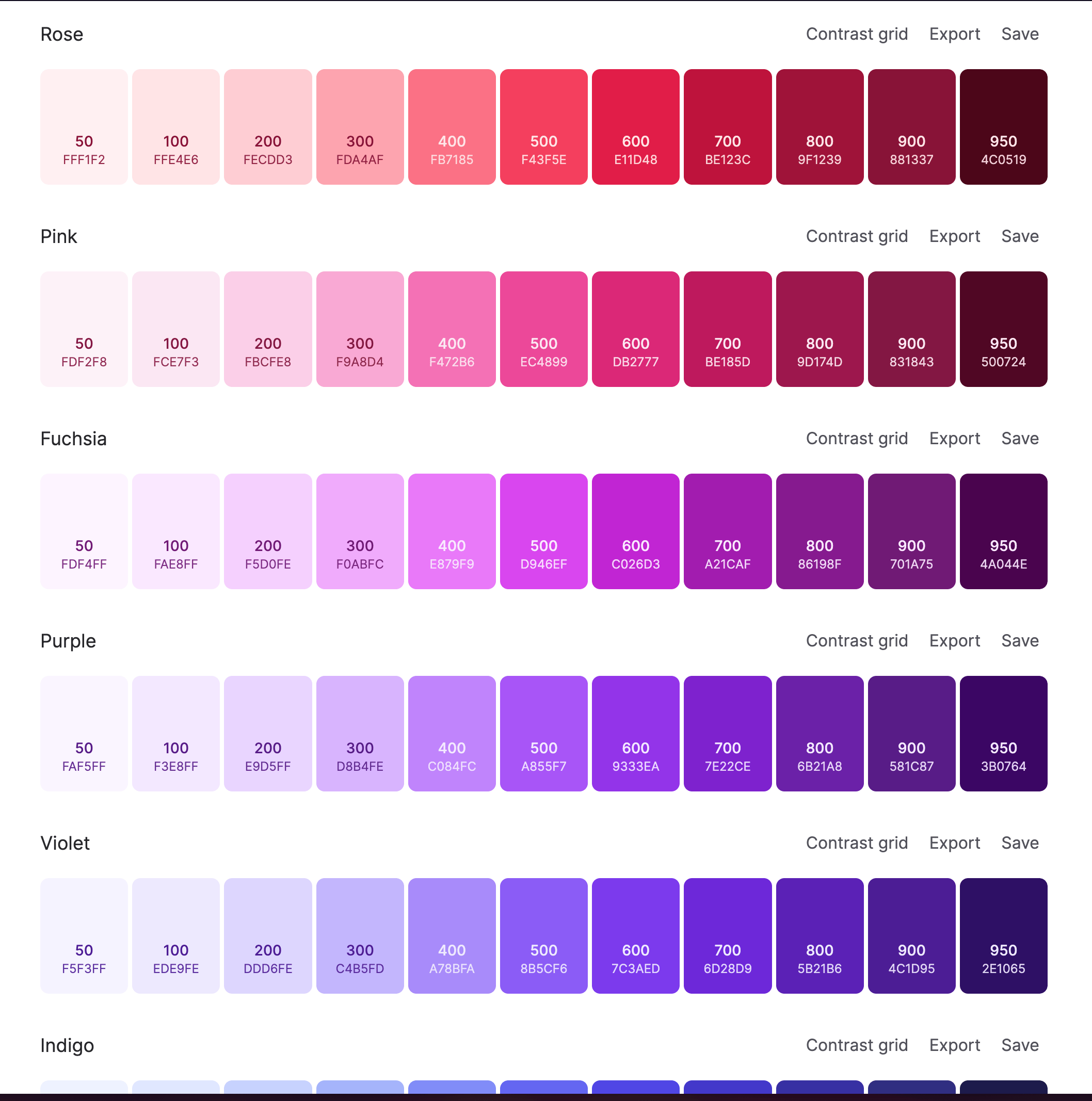
design tokens
To support multiple themes, all colors came from Tailwind CSS, as they are accessibility ready.

Let's get into the
Visual Design
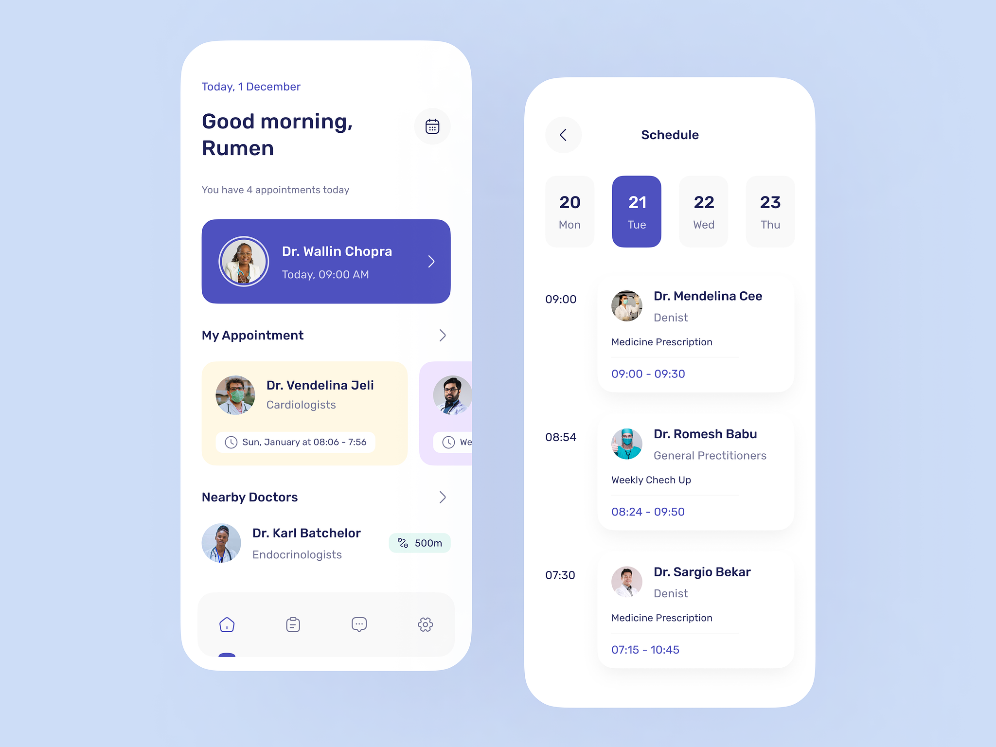
The first step was to take a look to the screens and components they already had to conceive a new idea.
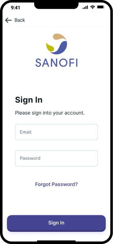

current screens
Client identity was applied in a limited way, only being able to choose one color from a limited set.
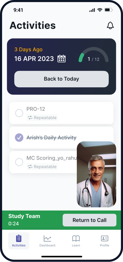
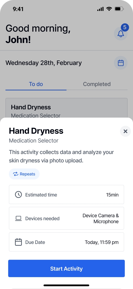
working on the wires
In order to address component efficiency, new layouts and features, wireframes were conceived.
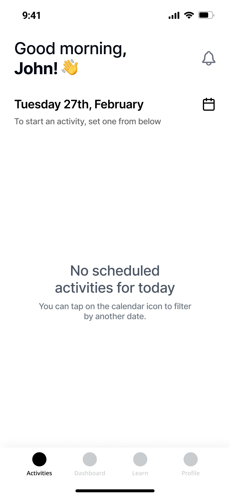
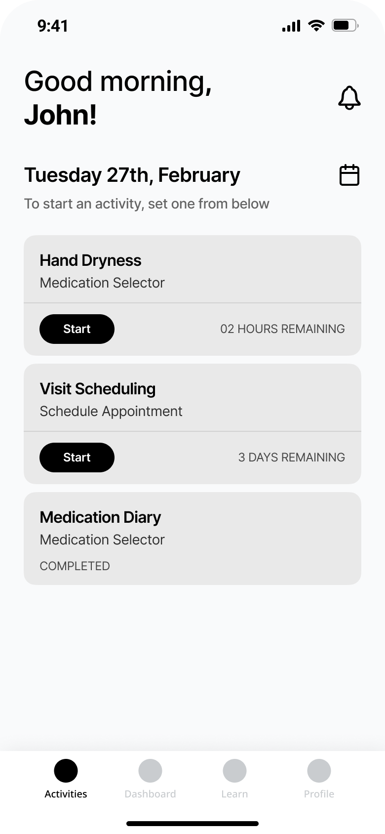
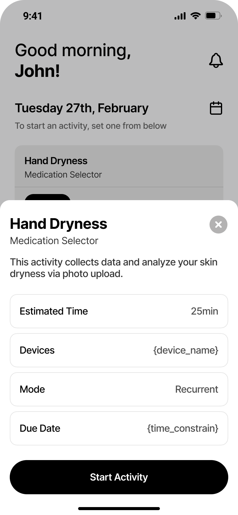
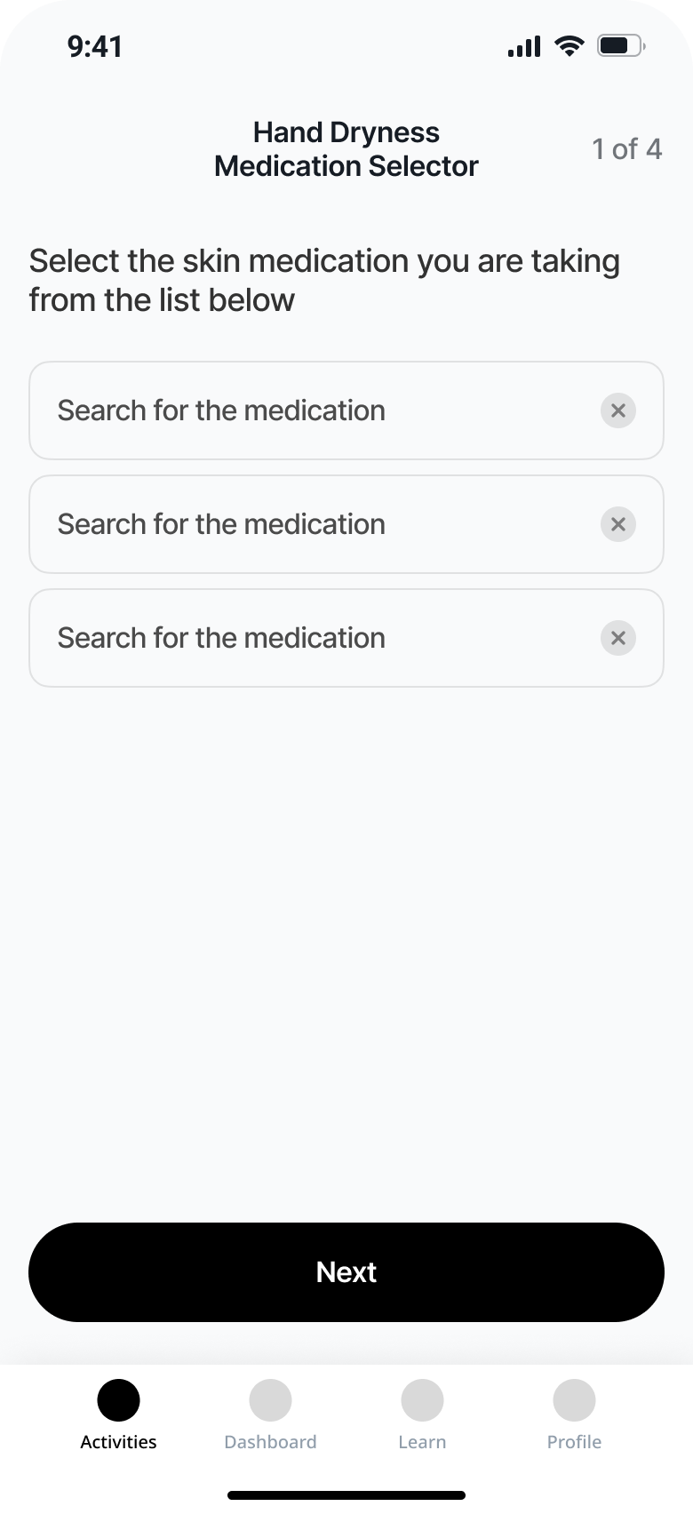
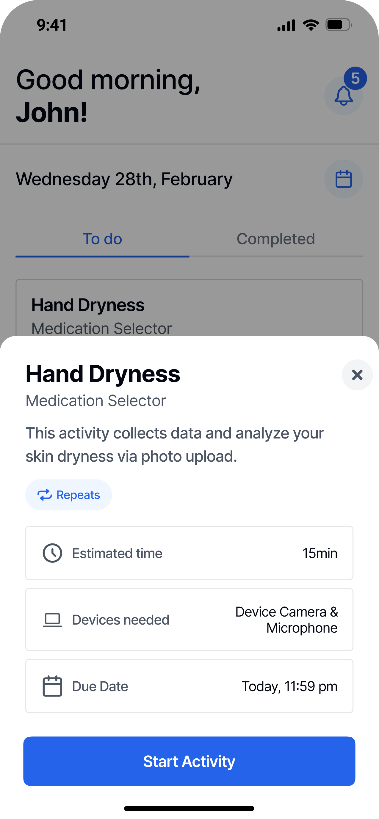
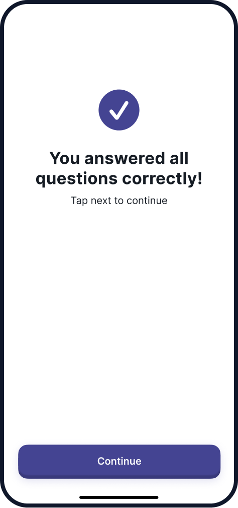
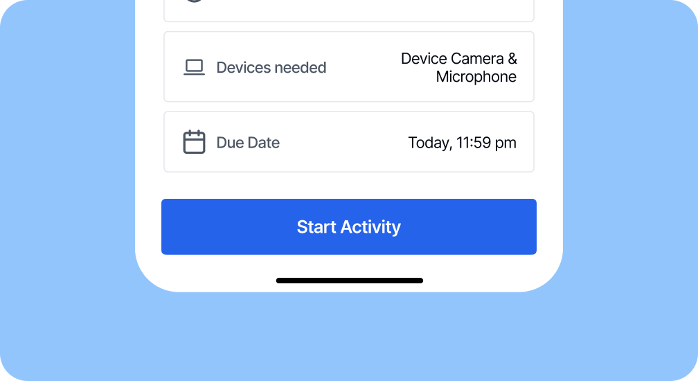
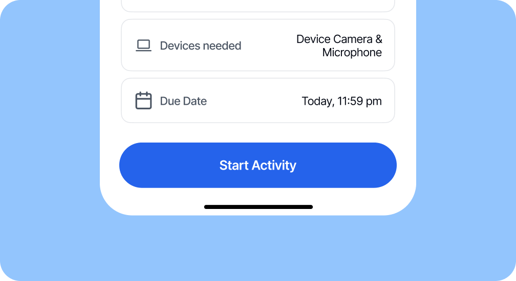
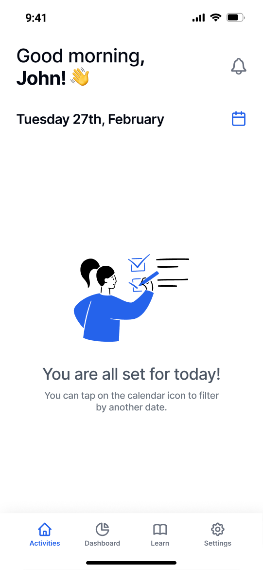
In the new version, the goal was to reduce clutters from screen as we shorten the path to activity completion. Also, being more clear on the goals and needs to each activity was a must, as the main personas were seniors and people with disability.
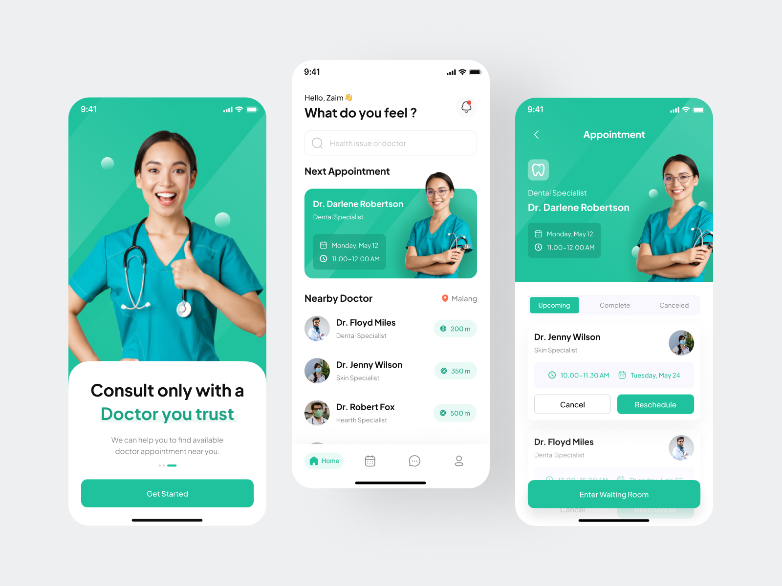
concepts
Considering the company was aiming on a standard rather than modern look, the ones on the left were approved.
approved
proposed
Enabling medical trials
Worldwide 🌎
problem statement
The company had an ongoing app but felt they needed to revisit the experience before scaling the features.
Visual redesign
for the base app
Map and Rethink all user flows
Scale with
design tokens
Mapping a white label application
The results
moodboard research
First, a glance into concepts for mobile health applications for visual inspiration.
benchmark research
Then went after existing health applications and
how do they work.
Creation of a
Design System
Using this process, it's possible to unlock the power of design tokens in Figma and keep code in sync with design decisions.
typography
Only few typefaces have the needed support for multi-languages. Testing the top #3 lead to Inter.
Inter
USAGE
4.68 billion
Number of times Google Fonts API served Inter over a week.
language support
Africa
457
Americas
127
Asia
104
Europe
161
Oceania
28
what's the color?
As the application was a white label, no specific color was chosen.
design tokens
To support multiple themes, all colors came from Tailwind CSS, as they are accessibility ready.
Let's get into the
Visual Design
The first step was to take a look to the screens and components they already had to conceive a new idea.
current screens
Client identity was applied in a limited way, only being able to choose one color from a limited set.
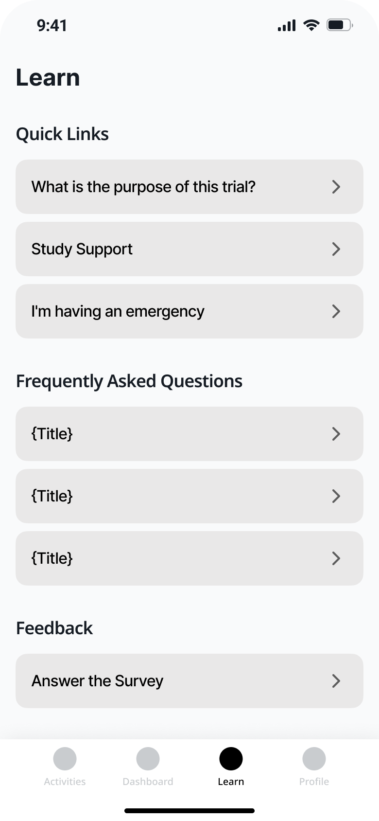
working on the wires
In order to address component efficiency, new layouts and features, wireframes were conceived.
In the new version, the goal was to reduce clutters from screen as we shorten the path to activity completion. Also, being more clear on the goals and needs to each activity was a must, as the main personas were seniors and people with disability.
concepts
Considering the company was aiming on a standard rather than modern look, the ones on the left were approved.
approved
proposed
Enabling medical trials
Worldwide 🌎
problem statement
The company had an ongoing app but felt they needed to revisit the experience before scaling the features.
Visual redesign
for the base app
Map and Rethink all user flows
Scale with
design tokens
Mapping a white label application
The results
moodboard research
First, a glance into concepts for mobile health applications for visual inspiration.
benchmark research
Then went after existing health applications and
how do they work.
Creation of a
Design System
Using this process, it's possible to unlock the power of design tokens in Figma and keep code in sync with design decisions.
typography
Only few typefaces have the needed support for multi-languages. Testing the top #3 lead to Inter.
Inter
USAGE
4.68 billion
Number of times Google Fonts API served Inter over a week.
language support
Africa
457
Americas
127
Asia
104
Europe
161
Oceania
28
what's the color?
As the application was a white label, no specific color was chosen.
design tokens
To support multiple themes, all colors came from Tailwind CSS, as they are accessibility ready.
Let's get into the
Visual Design
The first step was to take a look to the screens and components they already had to conceive a new idea.
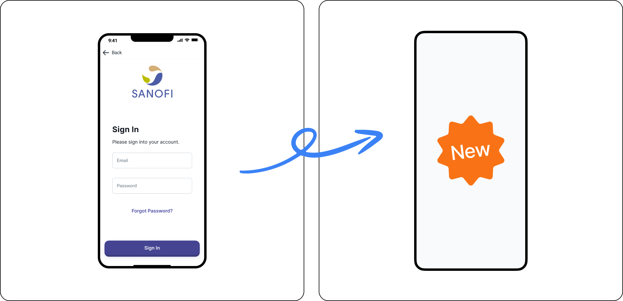
current screens
Client identity was applied in a limited way, only being able to choose one color from a limited set.
working on the wires
In order to address component efficiency, new layouts and features, wireframes were conceived.
In the new version, the goal was to reduce clutters from screen as we shorten the path to activity completion. Also, being more clear on the goals and needs to each activity was a must, as the main personas were seniors and people with disability.
concepts
Considering the company was aiming on a standard rather than modern look, the ones on the left were approved.
approved
proposed